Crypto.com Exchange Option Trading Terminal
Overview
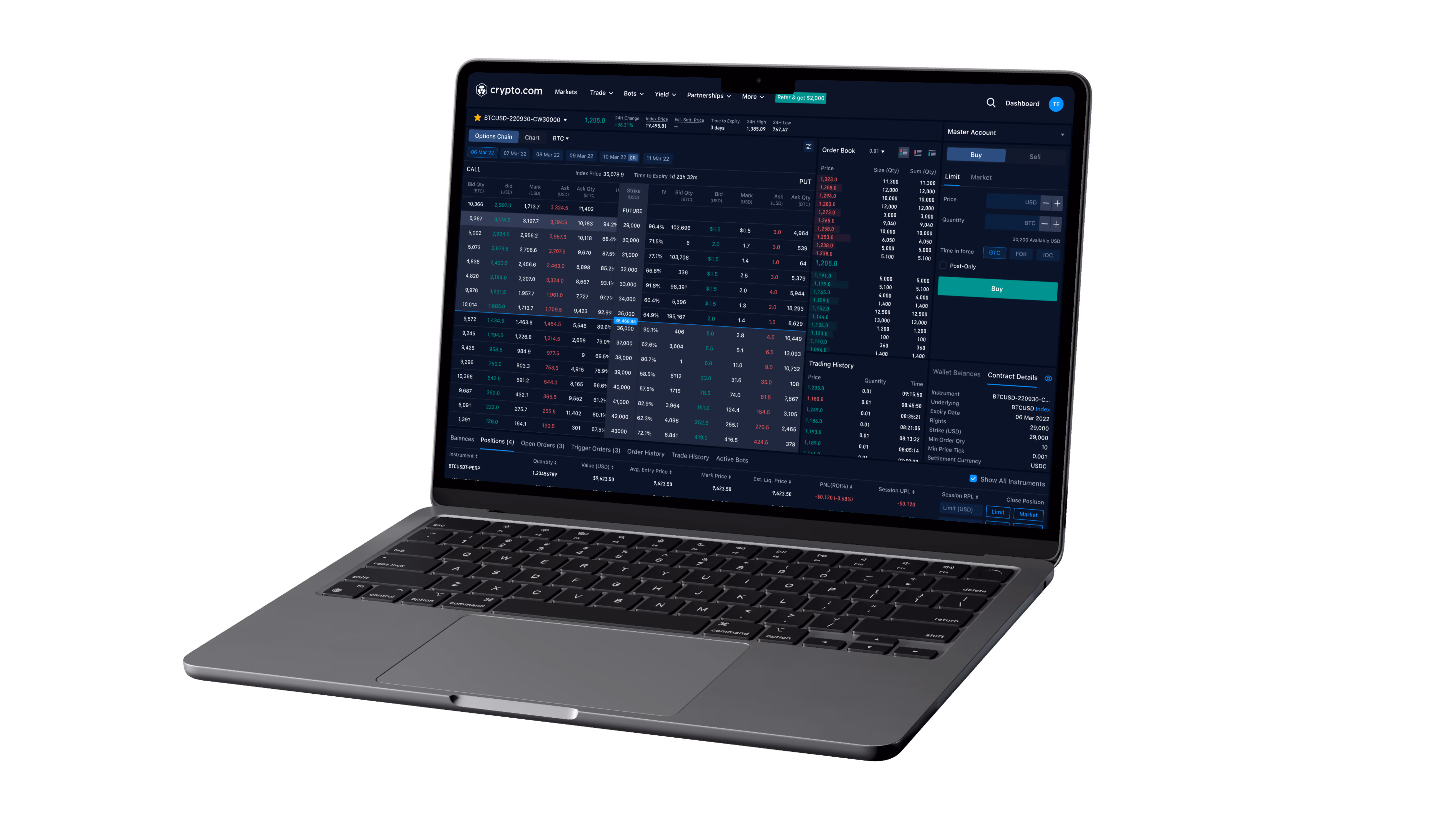
During my time at Crypto.com in 2022, I took on a tight 2-weeks internal sprint to design a potential options trading interface. Referencing Delta Exchange’s established structure and following the PM’s suggestion, the focus was on delivering a functional mockup using 100% of Crypto.com’s existing design system for seamless brand alignment.
Role & Constraints
Role:
UI Designer – Responsible for translating requirements into screens, applying the design system, and creating an interactive prototype.
Constraints:
Timeline: 2 weeks only.
Research: No in-depth user research – relied on PM + competitor reference (Delta Exchange & Binance).
Scope: Frontend UI & basic interactions only (mock data, no backend integration).
Goal: Quick validation of layout, information density, and design system fit for high-complexity trading UI.
Domain knowledge: Limited prior experience in options trading – required fast self-learning of core mechanisms, Greeks, strategies, and industry jargon during the sprint.
Approach
1. Competitor reference: Delta Exchange, Binance
2. Basic user behavior research
3. Applying Crypto.com design system to maintain consistency.
4. Rapid iteration: from low-fidelity layout → high-fidelity screens → basic interactive prototype
2. Basic user behavior research
3. Applying Crypto.com design system to maintain consistency.
4. Rapid iteration: from low-fidelity layout → high-fidelity screens → basic interactive prototype
Research
Heavy early reliance on competitors for structure and flows. To ground it in real use cases, I drafted a simple options trading scenario via quick online research and informal chats with Crypto.com PMs (many with advanced trading experience), guiding minor refinements.
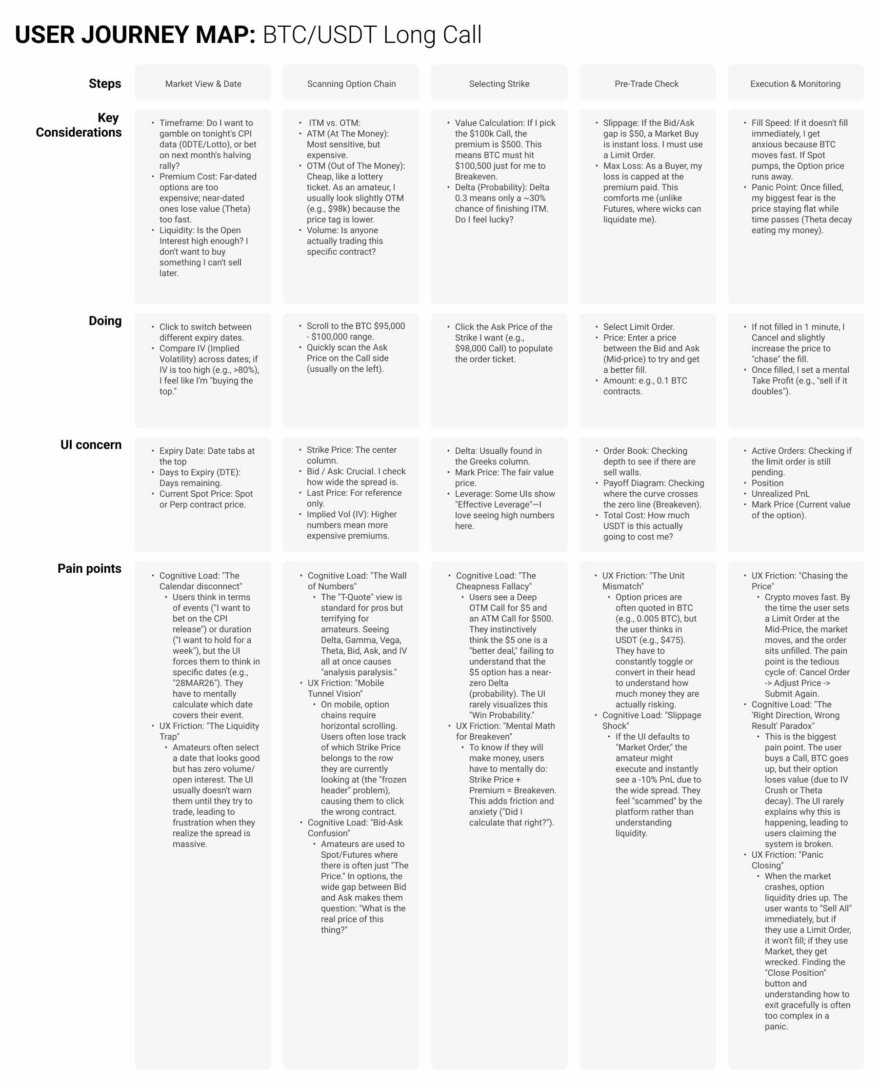
* Only the most feasible pain points were tackled to maintain a lean, fast delivery.
Design Decisions
1. Design treatments
Pain points were noted, though time and tech constraints prevented addressing every one. Those with lower dev cost or simpler fixes were prioritized and resolved.
Examples:
Examples:
Example 1: Added a tiny contextual label beside the expiry date, highlighting real-world events (e.g., CPI announcements or rate cuts) that may impact trading strategies.
Example 2: Default view hides most indicators to minimize overwhelm for beginners, showing only a balanced subset across Price, Volume/Liquidity, and Risk/Greeks. Advanced users can toggle or add more indicators based on their preferences.
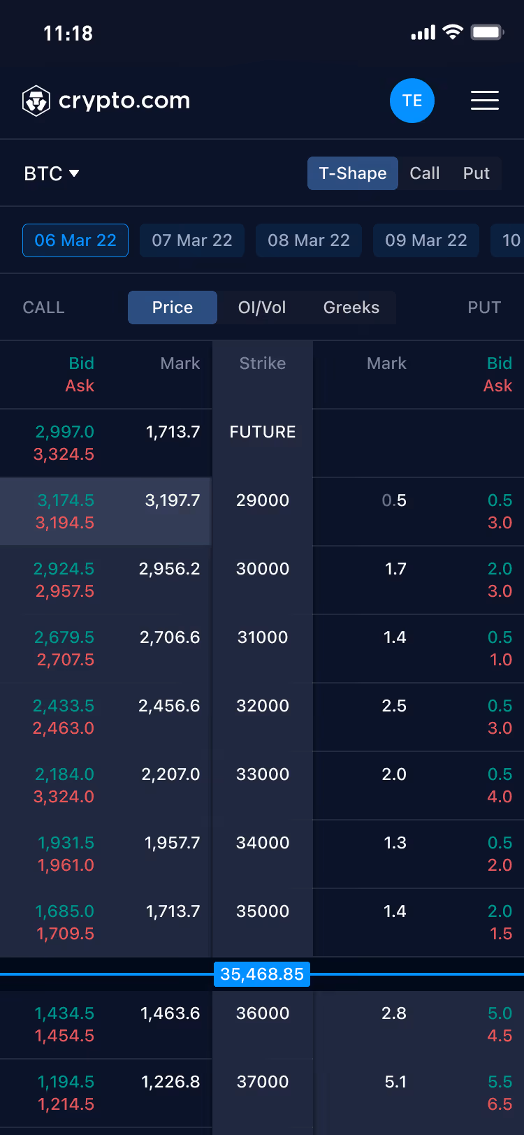
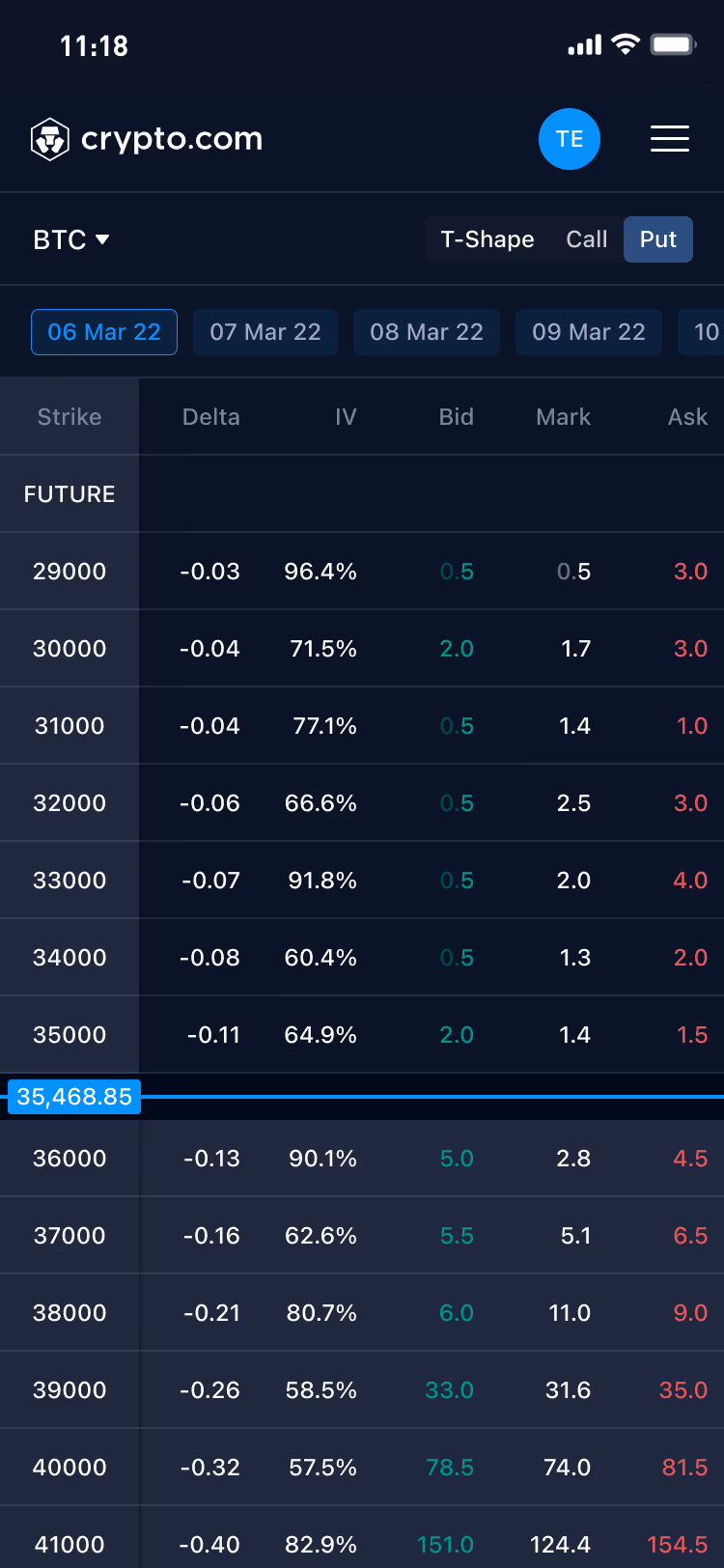
Example 3: Mobile cognitive load was addressed by consolidating indicators into three toggleable modes—Price, Volume/Liquidity, and Risk/Greeks—mirroring the curated selection approach used in the desktop default view.
2. Brand fidelity
Brand consistency and development efficiency were prioritized by reusing more than 95% of the existing design library components. This proved the system’s strong scalability, supporting both lightweight UIs and advanced trading interfaces with minimal custom work.
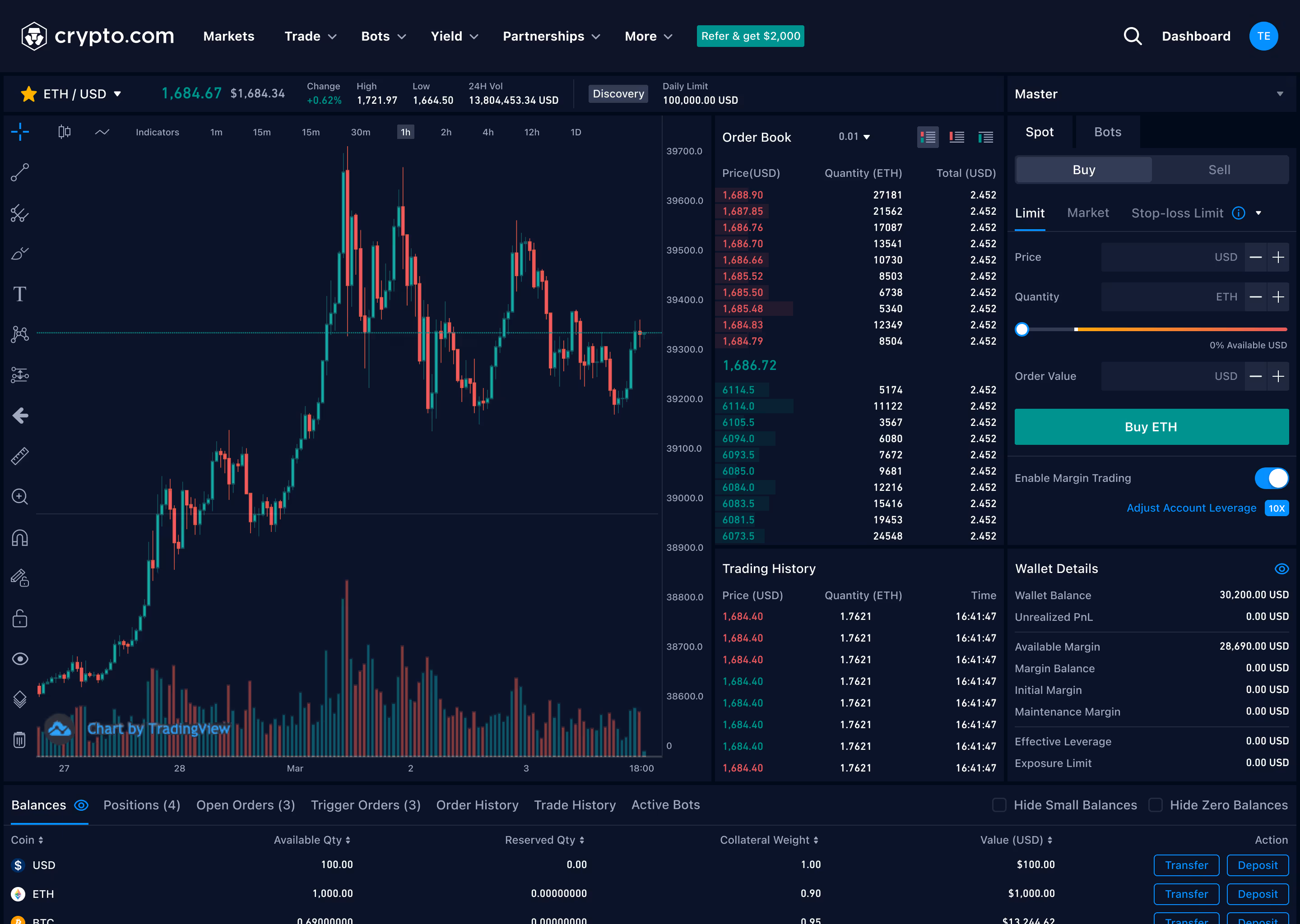
Spot trading
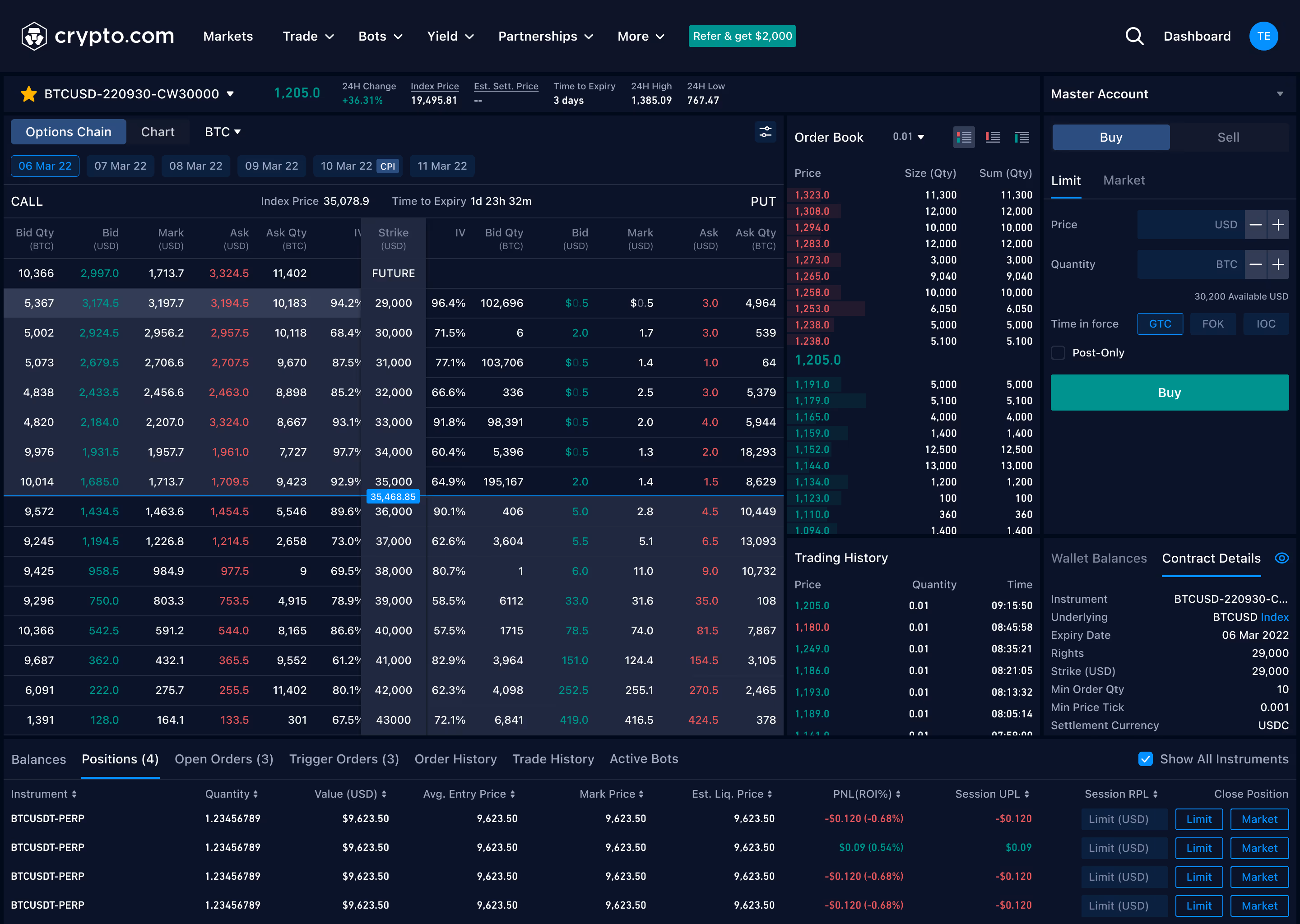
Option trading
3. Interactions
With limited space in the options chain, interaction becomes key to how users navigate, explore, and compare information. An interactive prototype was vital for effectively conveying these behaviors during handover.
Example: Showing T-shape quote with freezed strike column.
Outcome & Learnings
This rapid prototype successfully provided a tangible visual reference in a very short time, helping the PM and team evaluate the UX direction for an options feature. Although it did not proceed to formal development, it validated the applicability of Crypto.com’s design system in complex financial trading scenarios. If the project were to move forward in the future, improvements could include better mobile details, educational tooltips, and risk warnings.